


How to prepare files
“Color separation?” “Grayscale?” “Ink selection?”
Let’s master the
steps to submitting files!
Contact Us │ About RETRO INSATSU │ How to prepare files
The keys are “Color separation” and “Grayscale”
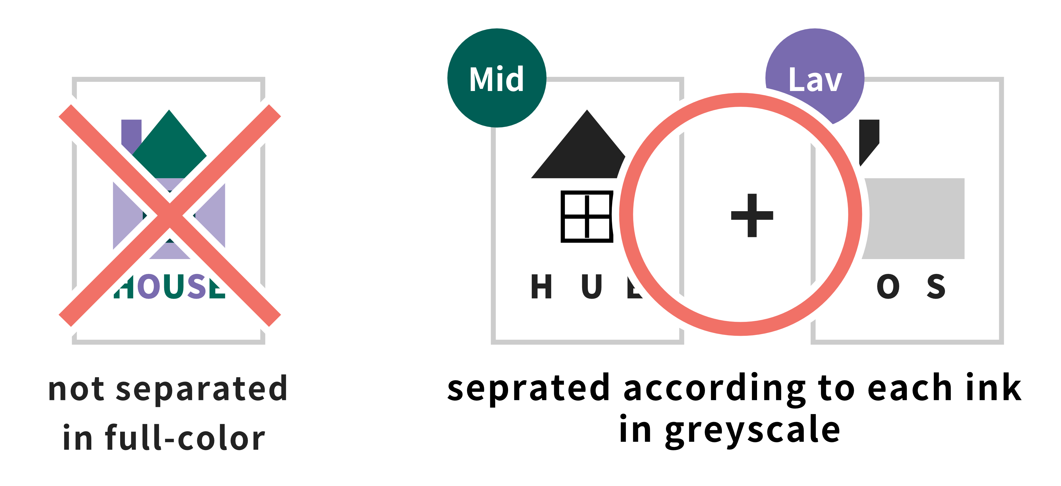
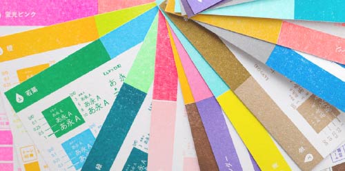
Retro INSATSU uses a “stencil printing” process, in which each color is printed one at a time, using one
stencil for one color. This is why we cannot print full-color files as they appear.
Whether done by a
computer or hand-drawn, please separate your files into each ink you want printed with and submit them in
grayscale. Inks will not be in a mixture of CMYK, but can be selected from our wide range of Retro INSATSU inks.
Basics of File Preparation
Not sure how to prepare your files?
If you follow the rules of “Color separation” and “Grayscale”, it’s not much different from full-color printing.
If you’re not sure about anything, please feel free to contact us. Our staff will be happy to help you!
This is just one example of how to prepare your files.
As long as the files are printable with Retro Printing, you can create it in any way you like.
Create image in color
First, create your image without thinking about color separation.
Choose inks and separate image into each color
Choose which Retro Printing inks you would like to use and then separate your image into each color.
Convert to grayscale
As the final print’s opacity depends on the greyscale file’s opacity, convert file to grayscale.
Adjust opacity
Simply converting to grayscale tends to make images very pale. That’s why adjusting opacity is key.
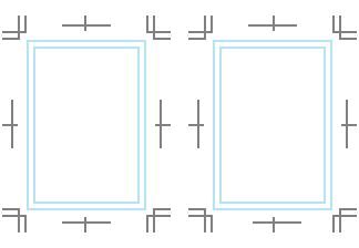
Check bleed / border area
Check to see if you need to add bleed or if there are any texts or illustrations that are outside of the safe zone and may cut off.
Specify ink and submit
Specify your desired ink by color chip and/or file name, depending on the format of your files. Now you’re ready to submit!
1Create image in color
At first, you can create your image without thinking about color separation and overprinting.
Of course you
are free to work in grayscale from the very beggining, having in mind which ink you would like to use. As an
example we will guide you through the steps in making your files when printing with 2 colors.
Create in full-scale
All files (including hand-drawn), regardless of the format of submission, must be created in its actual size.
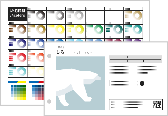
Retro Printing inks
Because Retro Printing inks are different to CMYK, it may be easier to have a rough idea of which inks you would like to use beforehand.
Acceptable Formats

2Choose inks and separate image into each color
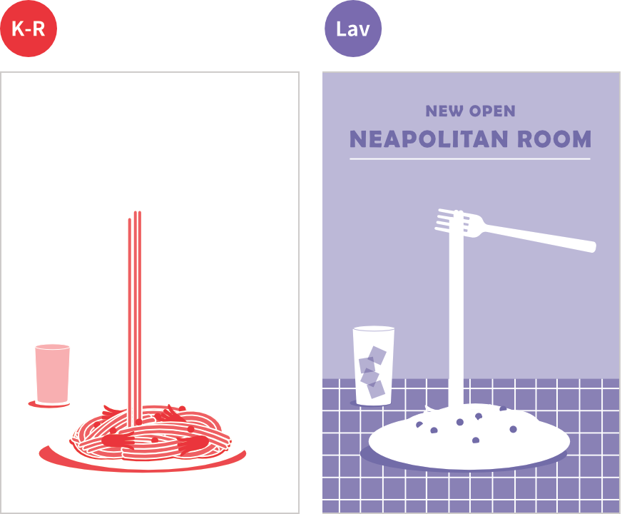
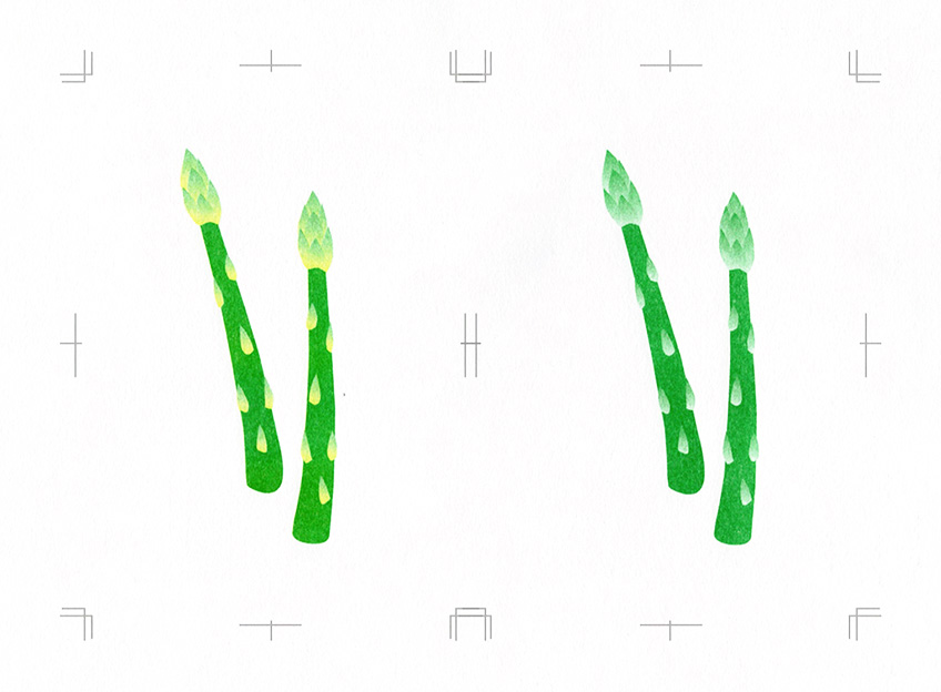
Separating into 2 colors
Separate your color image into each ink.
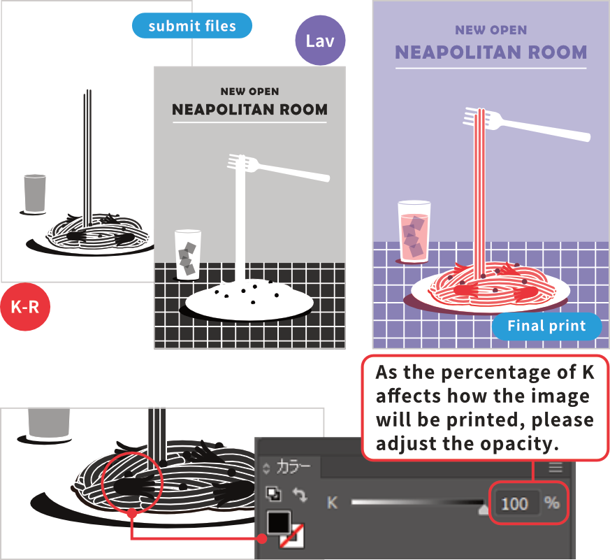
In this example, the image was created to be printed in 2 colors; “Fluorescent Red (K-R)” and “Lavender(Lav)”, and so the image is separated into 2 files.
Since the areas where colors overlap cause overprinting, for any areas you would like to avoid color to mix, knockouts are a must. Here, the green peas will be overprinted. For each ink, please save as a seperate file.
- There is no need to separate the same ink for different opacities.
- Mis-registration will be more visable when overprinting fine designs. We recommend designing with considering 1~3mm mis-registration.
3Convert into grayscale
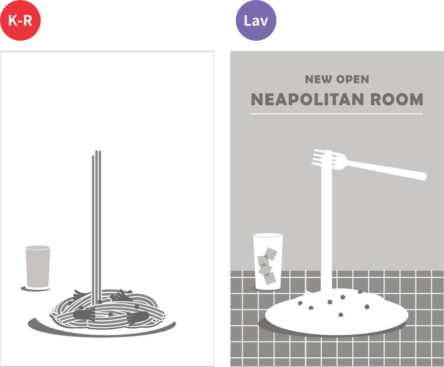
Convert into monochrome (grayscale)
There are 2 ways to convert your image into grayscale.
“Grayscale” which converts images into shades of white and black (K0~100%) including gray areas and “Bitmap” which converts into either white or black (K0 and K100%) excluding all gray areas. At Retro Printing, we recommend converting by “Grayscale”.
Once converted to grayscale, files cannot be changed back to color. We recommend that you back up your data before conversion,and also to check the grayscaled result carefully.
4Adjust opacity
Adjusting grayscale opacity
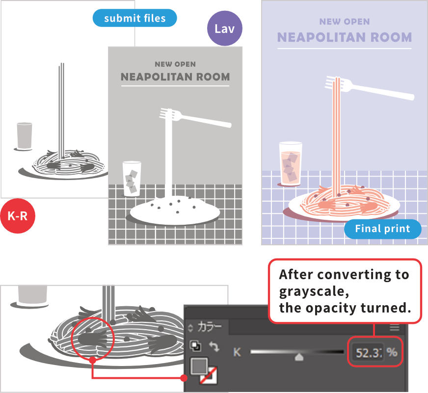
Adjusting gray opacity
With Retro INSATSU, the opacity of gray will directly become the opacity of the ink when printed. If you submit files that have simply been converted to grayscale, the overall result may be lighter than you expect. This is because the color’s brightness when in full-color affects the grayscale’s opacity upon conversion.
After converting to grayscale, the opacity of the sausage turned to K53%. However because we woud like to print the sausage in 100% “Fluorescent Red (K-R)” opacity, we need to adjust the gray to K100%. Accordingly we will need to adjust the opacity for all other areas.
When there are areas of colors overlapping, it is safer to reduce the opacity to less than 90% because mixing colors of 100% opacity tends to cause severe color unevenness and can cause all sorts of troubles. Here in this example, both colors which overlap to create the green peas, the opacity has been reduced to 90%.
If you adjust the opacity on the “Transparency” window, the final print may seem paler than how it
appears on the screen.
It is best advised to adjust the opacity by the percentage of “K (black)
0%~100%” and leave the opacity on the “Transparency” window at 100%, unless you have specific reasons.
If you don’t adjust opacity…
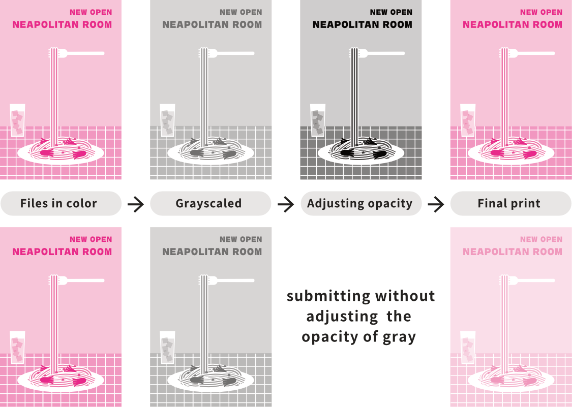
Printing with files which have only been converted into grayscale, may result in a much paler/fainted print than you expect. Please be careful especially with pale and bright tones including pastel and fluorescent colors, as grayscale conversion can reduce the color opacity greatly.
Increase contrast
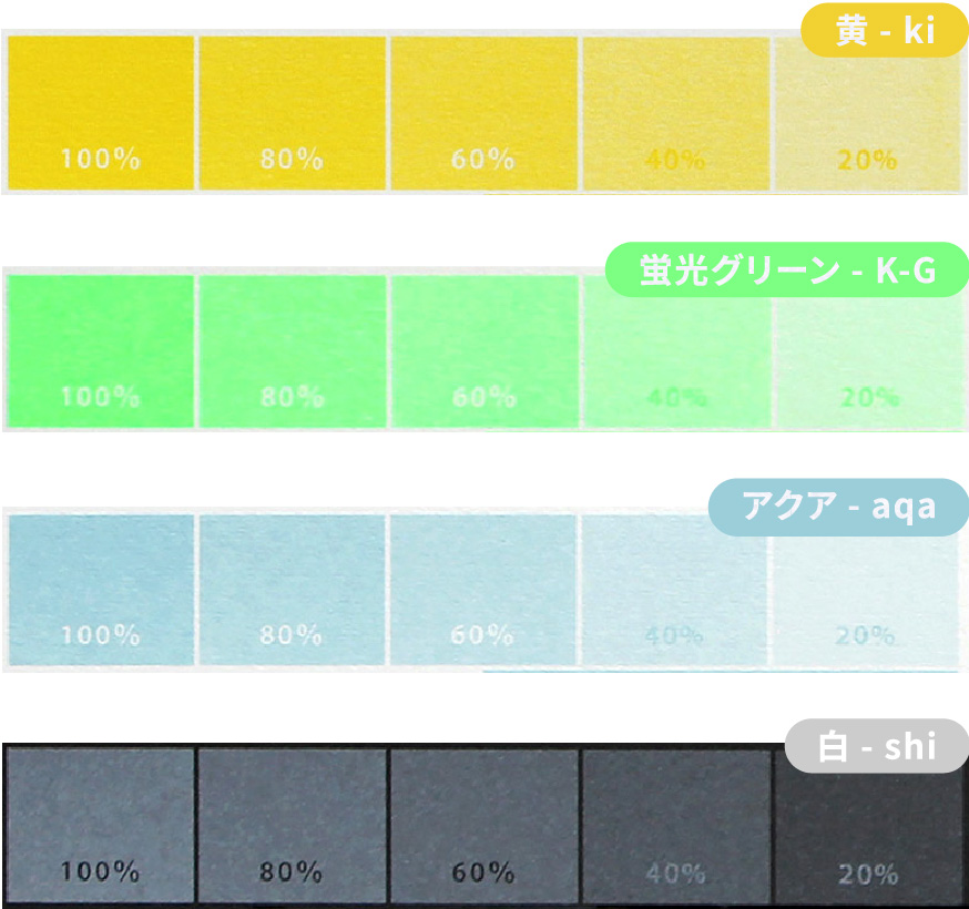
With Retro Printing, prints will come out with inks smudges and inconsistant coverages which means subtle opacity differences between 5%~10% will not be visible.
In particular, bright inks such as yellow, white and pastels are not good at creating shade variations. If you would like to make a strong contrast, please adjust the opacity to at least 30%.
Depending on your ink choices and designs, even with 30% opacity contrast, it may be difficult to print your desired color tone. If you are worried about the finish, please get in touch with us.
5Check bleed / border area
Once your here, you’re almost finished!
Depending on your chosen printing specification, let’s check your “bleed” / “safe zone”.
*No problem if you have already set up bleed and trimmarks.
“With Border Printing”
“With Border Printing”
Light / medium weight paper
“With Border Printing”
Cardstock weight paper
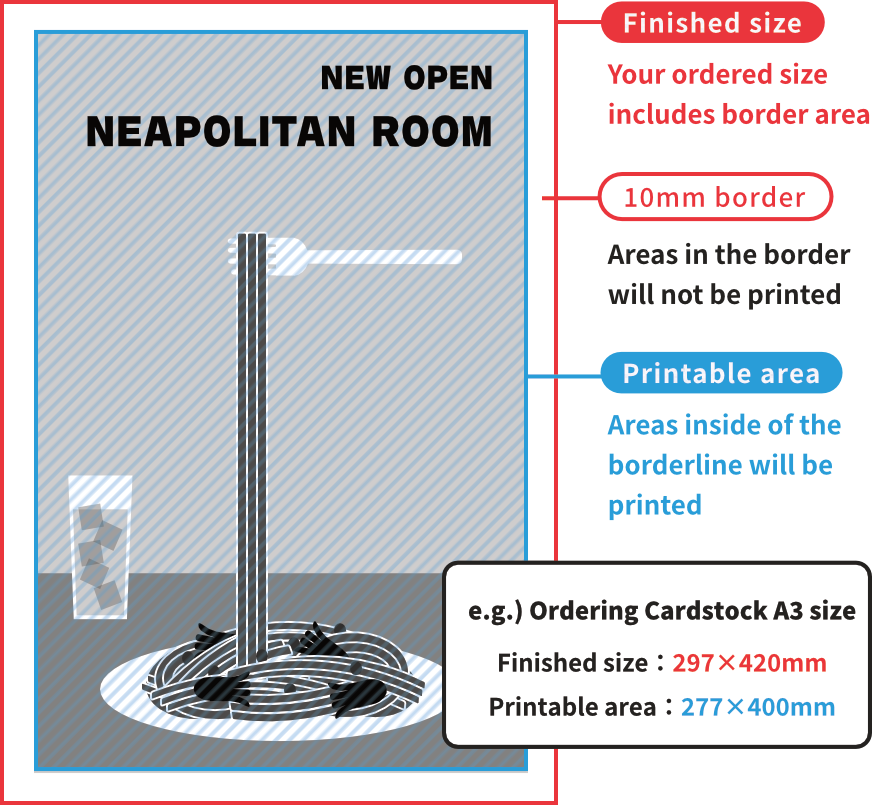
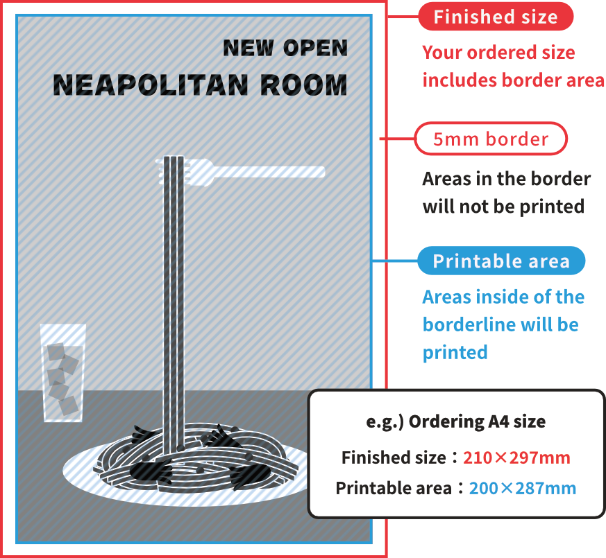
If you are printing “With Borders” there will be a blank (unprintable) space on all four side of the paper. Please bare in mind that texts and illustrations in these border areas will not be printed. Double check all your designs you want printed are inside of these borders!
Please submit your files with a border of 5mm width when ordering with light / medium weight paper.
For “With Border Printing” there is no need to add bleed or trimmarks. Please submit your files in full-scale, including areas of borders.
6Specify ink and submit
When your files are complete, please specify which ink you want each file printed with.
Even if you have attached a reference finished image, and your files are perfectly organized, if you have not specified your inks, your orders will be suspended until we can get in touch with you.
Submitting Illustrator files
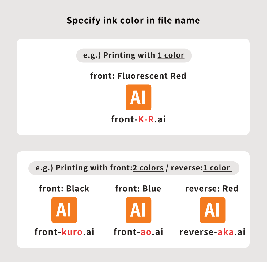
When submitting in Illustrator(ai) format, specify your desired ink by including the color chip name in your file’s name. Please refer to the list of ink chip names.
- Please save files seperately, one file for each color.
- Delete all images and text that are not necessary for printing.
- All texts must be outlined, just like any other print submissions.
About files
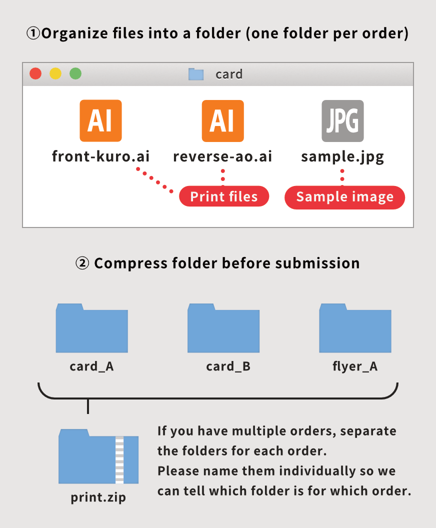
Please arrange completed files into one folder and compress before submission. One folder for each order.
Please name the folder with an order number or any preferred name, so we can identify which folder is for which order.
- When placing multiple orders, make a seperate folder for each order.
- It is not necessary to submit data that is not used for printing, such as files before being outlined. Submit only files that are necessary for printing, such as each color layer, linked images, and finished image sample.
- If you may have a finished image sample for color reference, please submit together.
Submitting Photoshop/JPG/PDF files
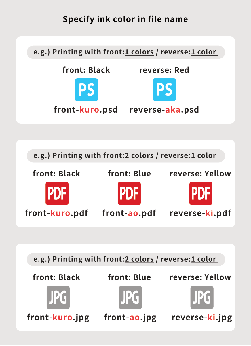
When submitting in Photoshop(psd),JPG and PDF format, specify your desired ink by including the color chip name in your file’s name. Please refer to the list of ink chip names.
- Please save files seperately, one file for each color.
- Delete all images and text that are not necessary for printing.
- All texts must be outlined, just like any other print submissions.
About files
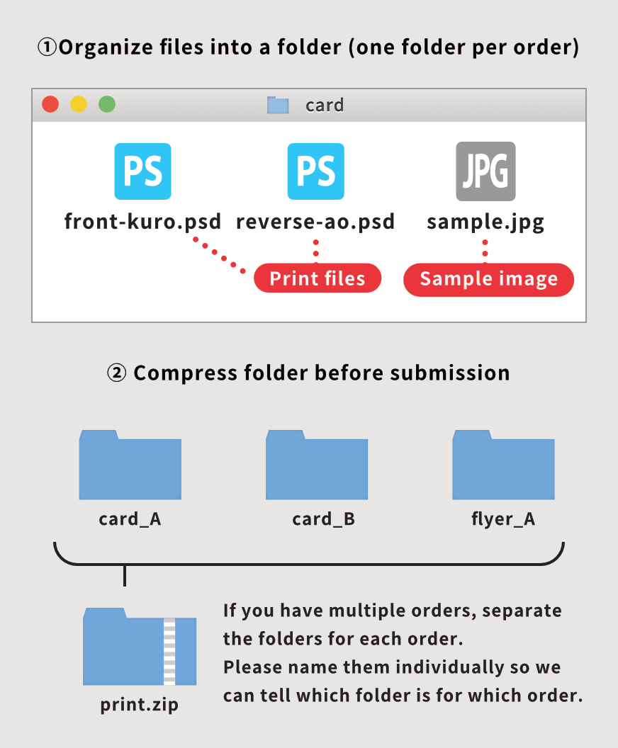
Please arrange completed files into one folder and compress before submission. One folder for each order.
Please name the folder with an order number or any preferred name, so we can identify which folder is for which order.
- When placing multiple orders, make a seperate folder for each order.
- It is not necessary to submit data that is not used for printing, such as files before being outlined. Submit only files that are necessary for printing, such as each color layer, linked images, and finished image sample.
- If you may have a finished image sample for color reference, please submit together.
